To compete in a saturated telecom market, Telekom Slovenije needed to relaunch IZI — a fun, simple, and familiar brand — as the go-to alternative for people who want value without complexity.
THE SOLUTION
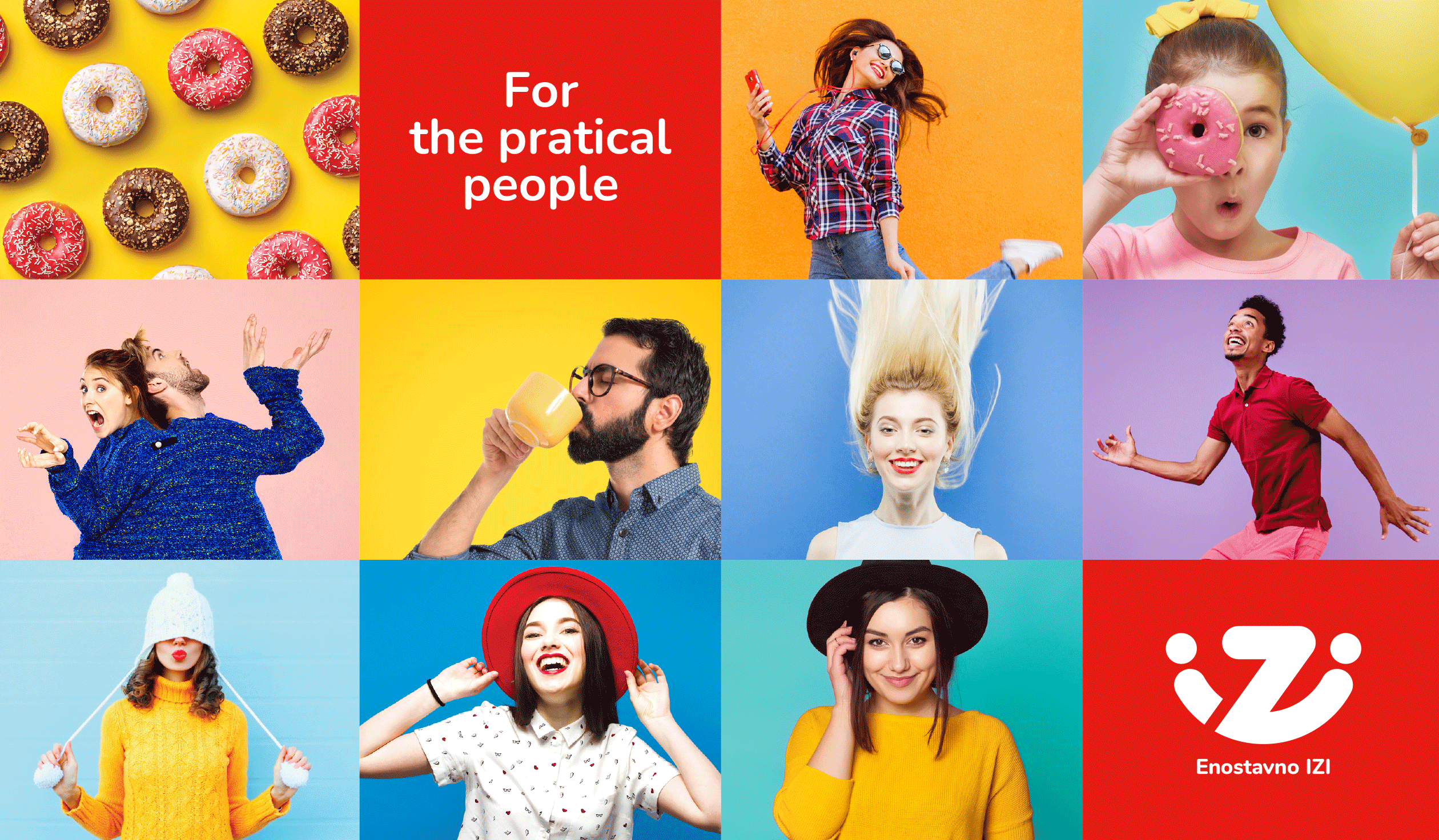
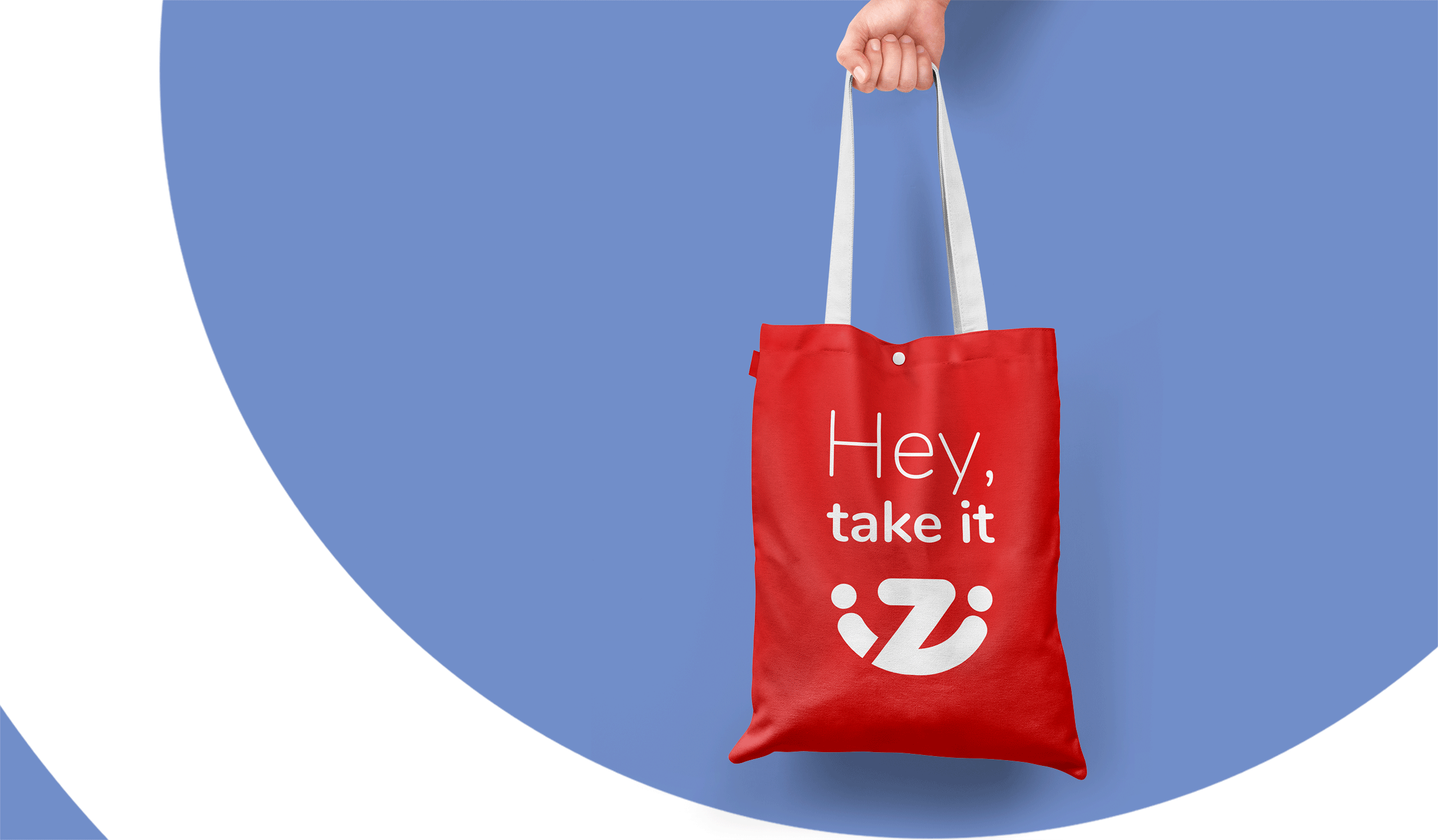
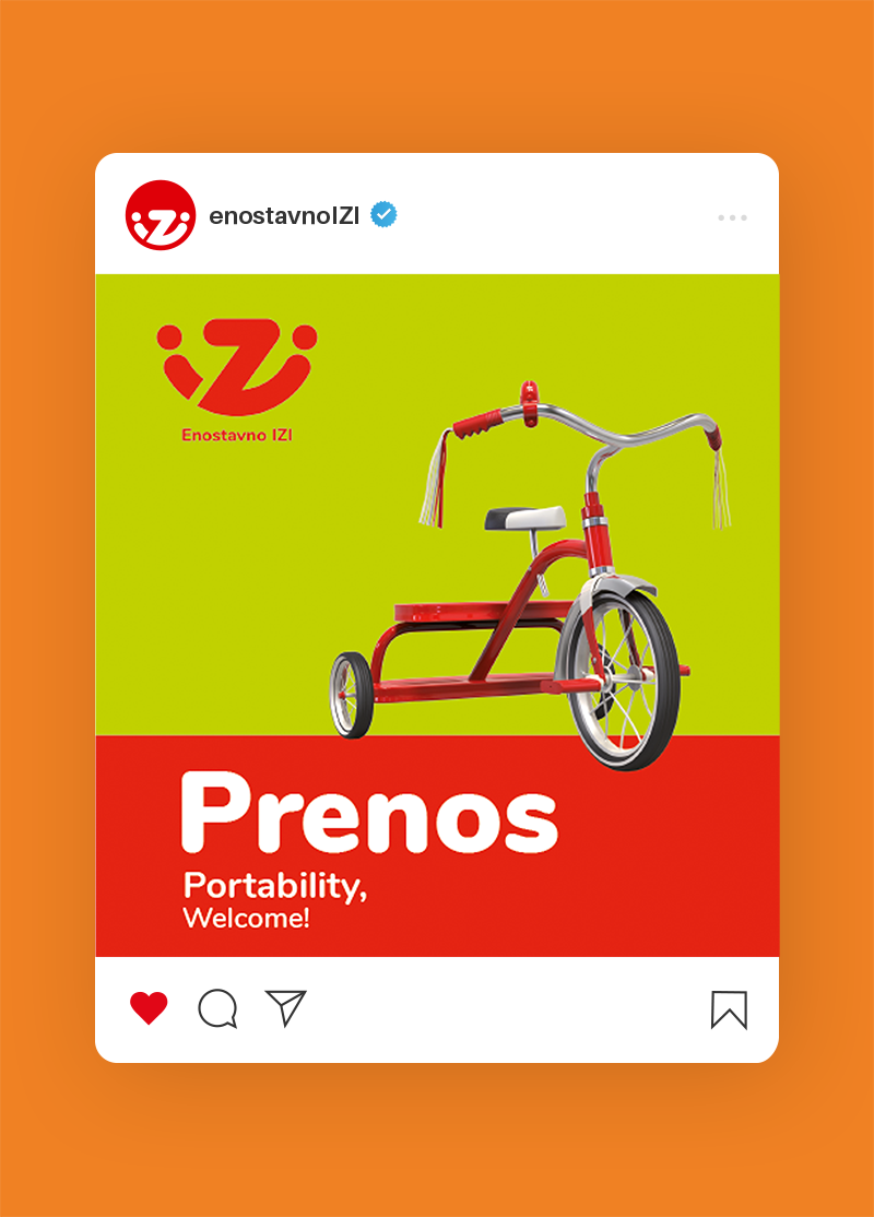
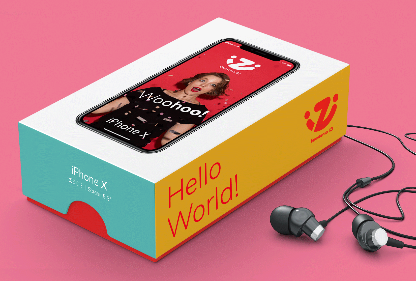
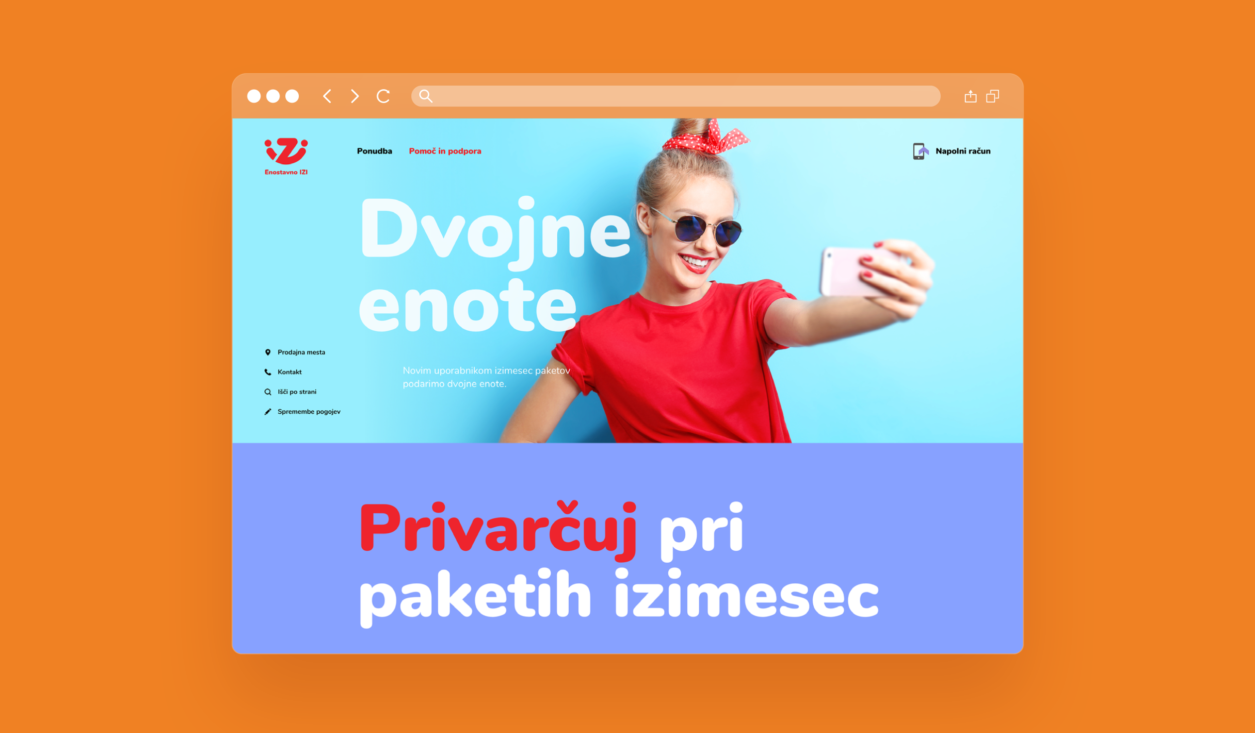
We gave IZI a bold new look: bright colors, clean images, and a logo that becomes a symbol of connection. Clear, casual, and warm — just like its offer.
A brand for the practical — because simple doesn’t have to be boring.