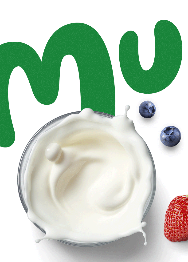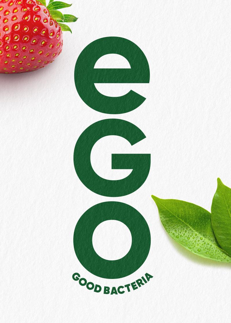
Zuzu, Romania’s leading dairy brand, built its reputation by breaking conventions. While competitors focused on meadows and cows, Zuzu introduced a vibrant, modern take on milk — celebrating the chaotic energy of family mornings with minimalist design and playful attitude. But as the brand successfully expanded into a wide array of dairy innovations — from fruit yogurts to protein-rich blends — its visual identity became diluted. The challenge was to re-center the brand around its core equity while creating a flexible system that could spotlight each product’s unique benefit.
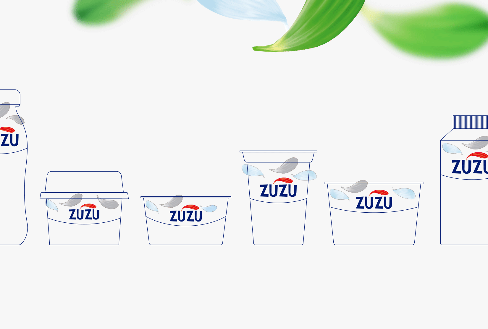
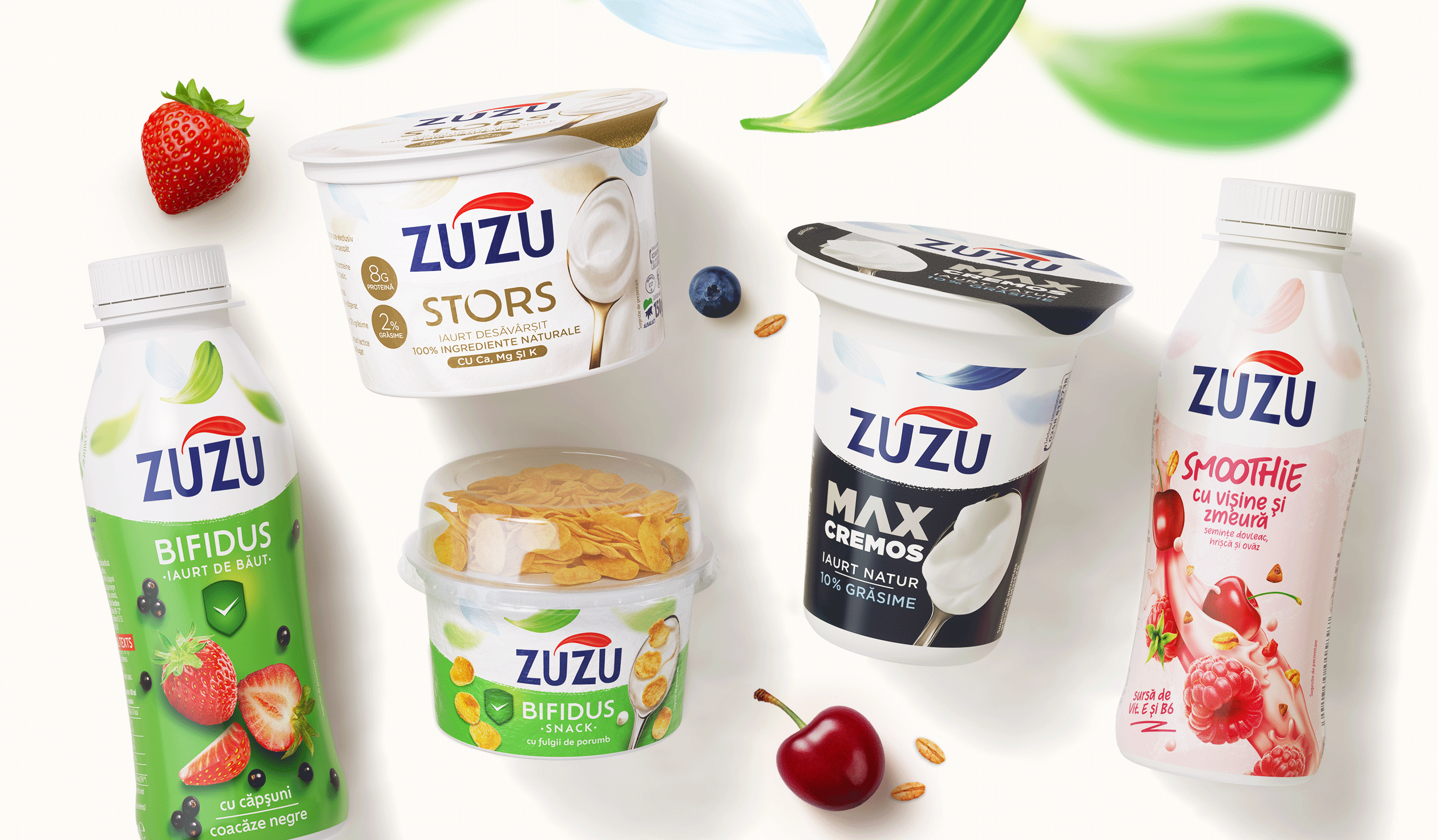
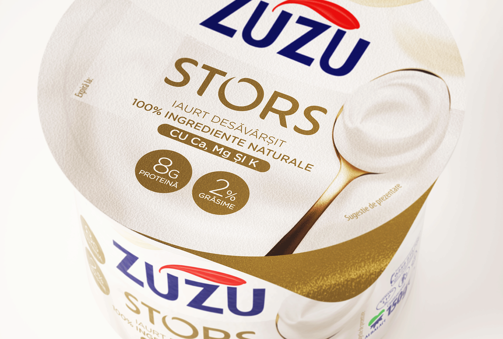
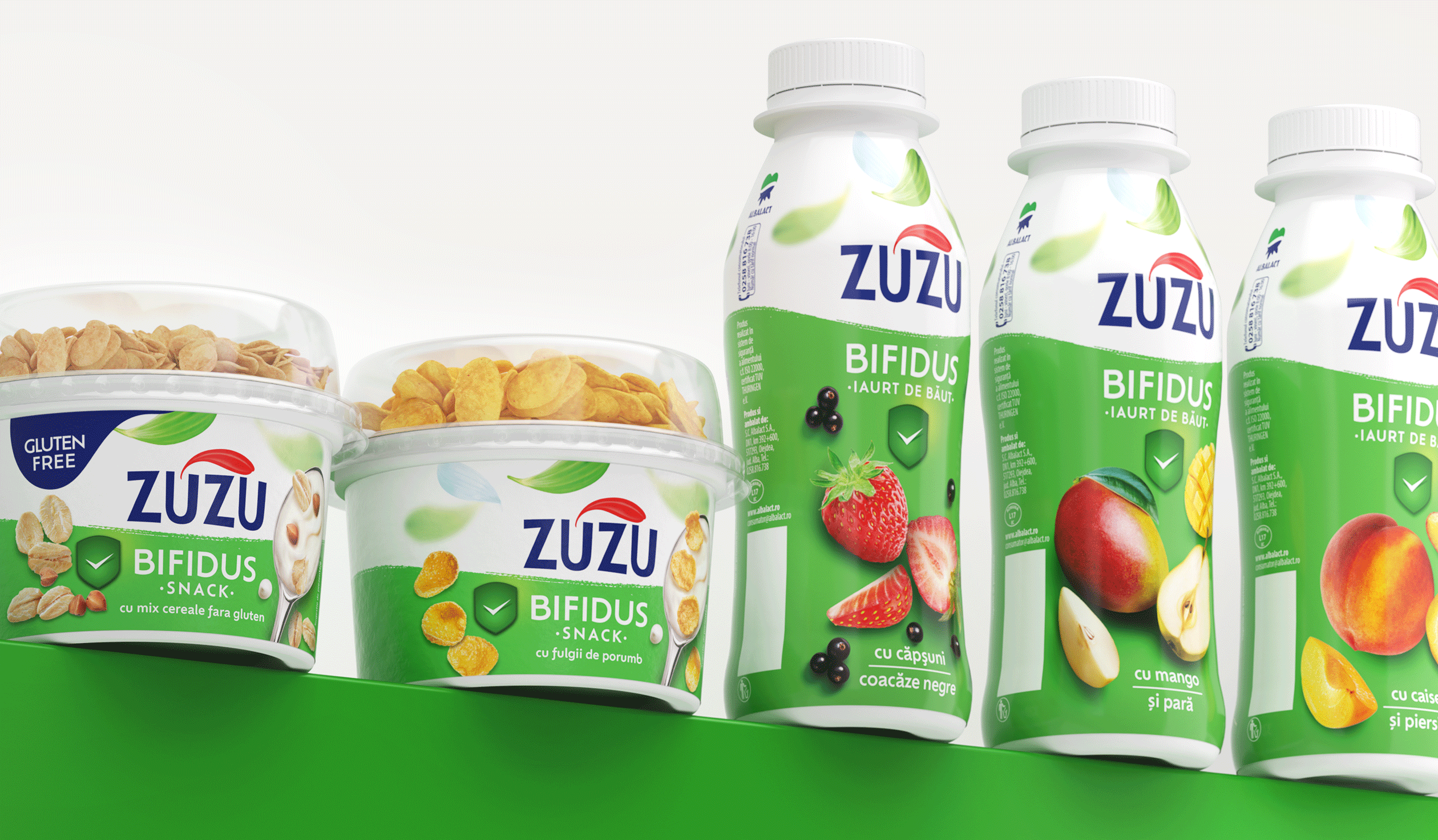
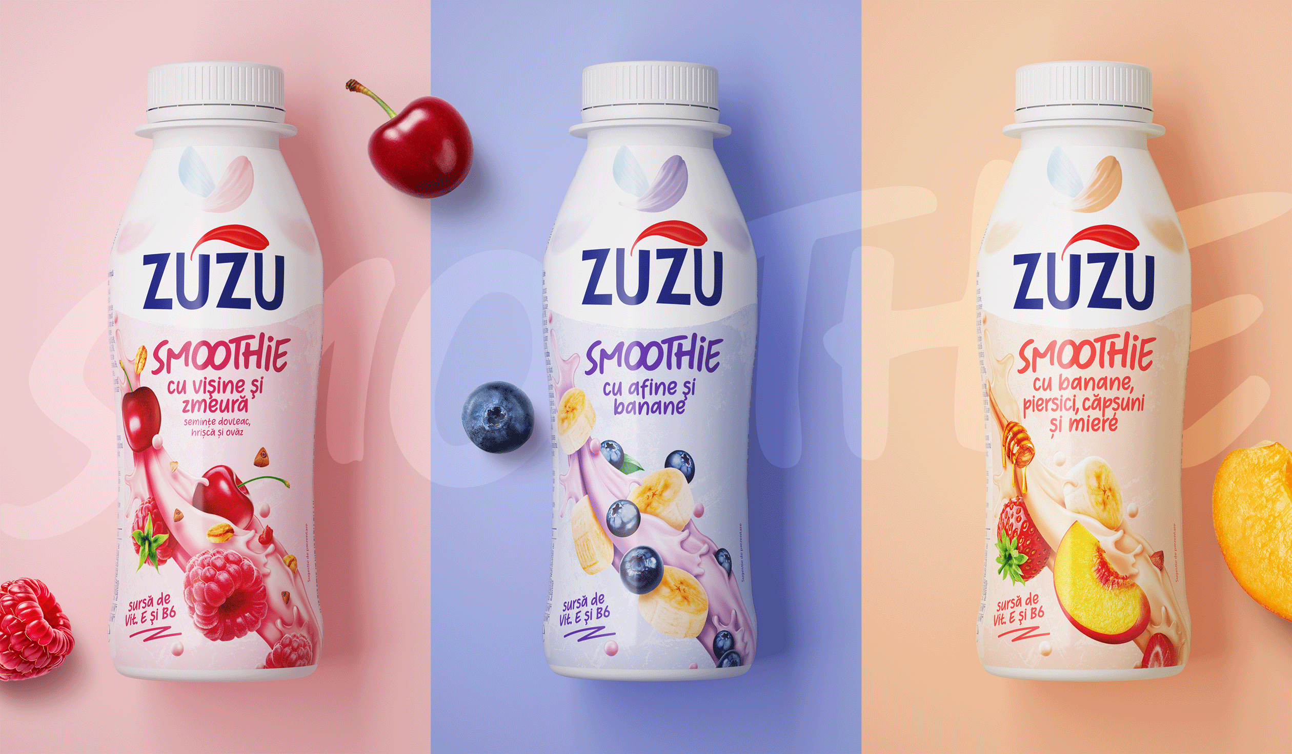
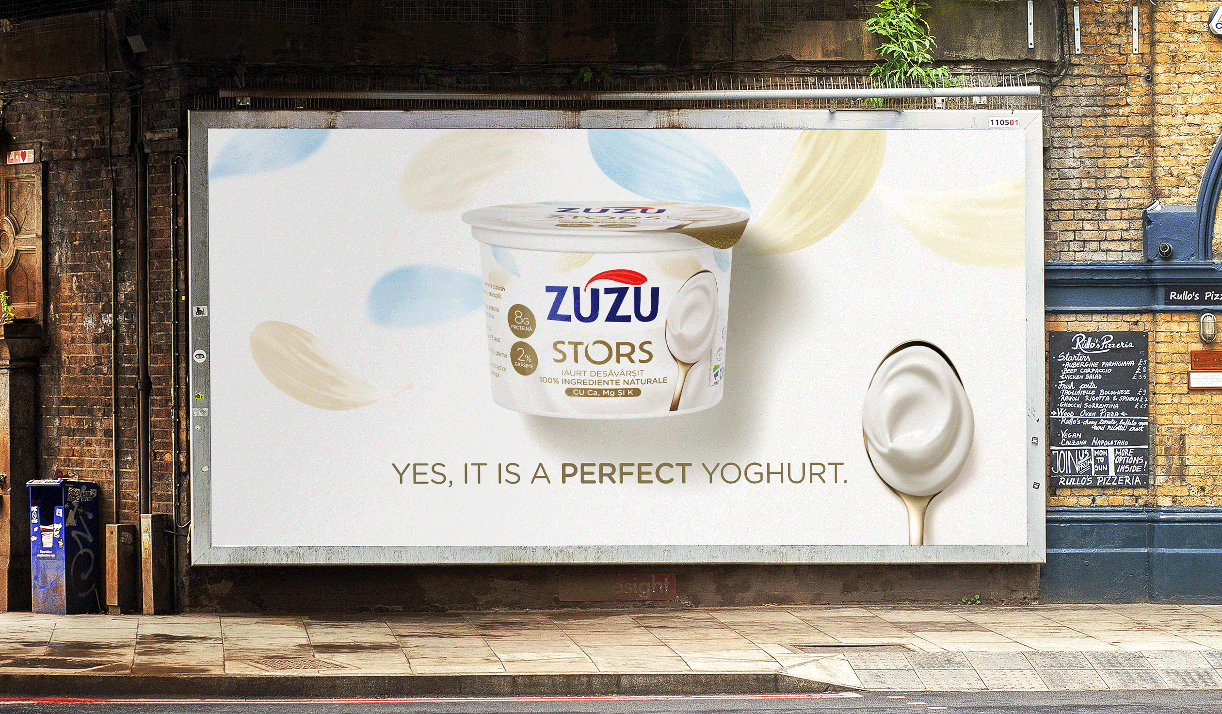
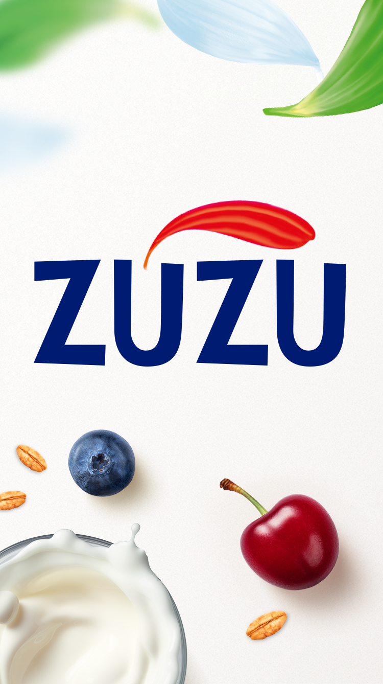
We designed a modular identity rooted in Zuzu’s iconic flower petal motif — a minimal, elegant structure that adapts effortlessly across the entire portfolio. This unified system anchors the brand, while allowing each product range to shine with its own expressive design: vibrant for fruit smoothies, premium for protein, fresh for bifidus, playful for the Stor line. The result is a seamless brand world where every innovation feels both distinct and unmistakably Zuzu. One brand, endless possibilities — always with the same joyful spirit.