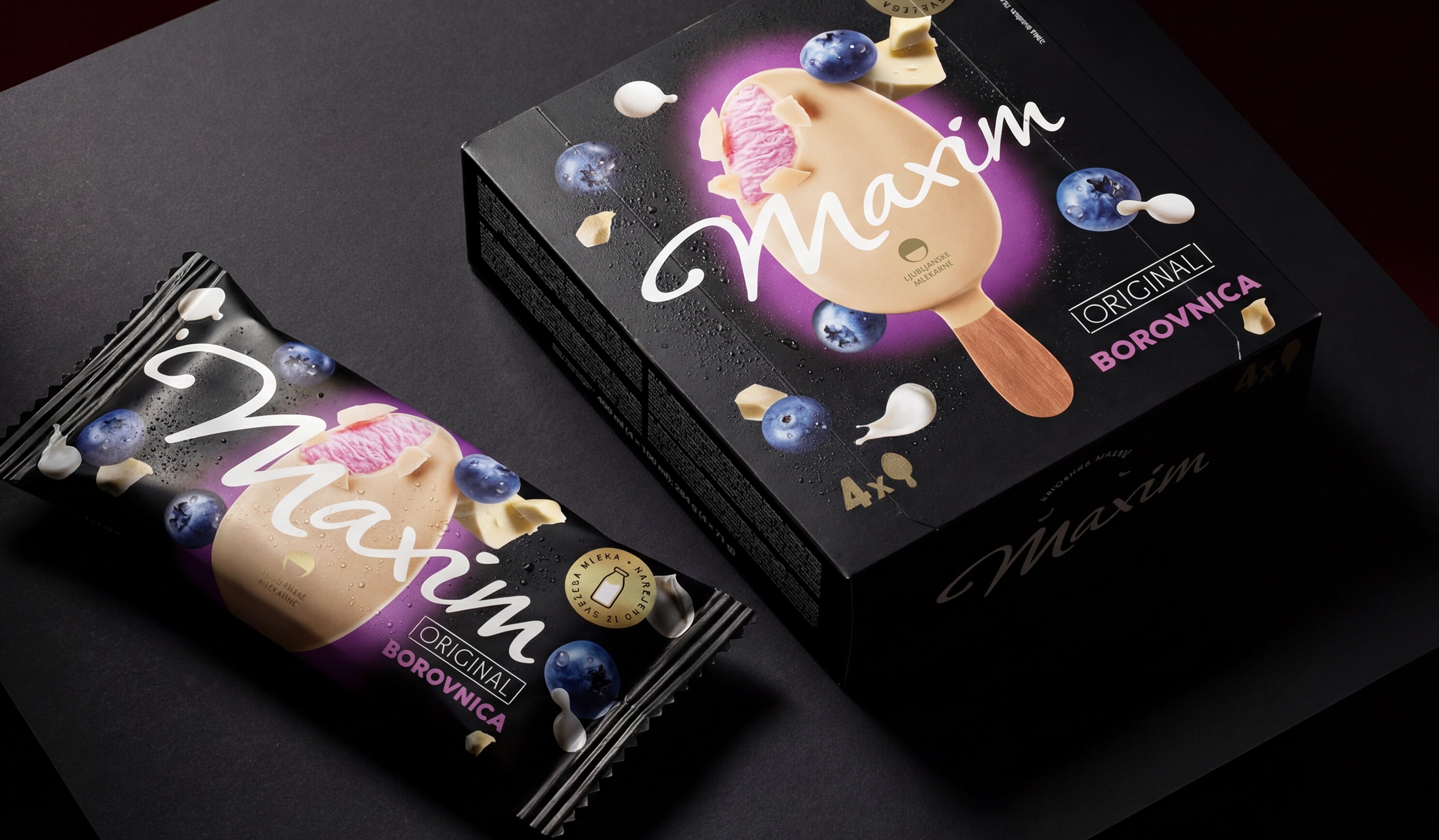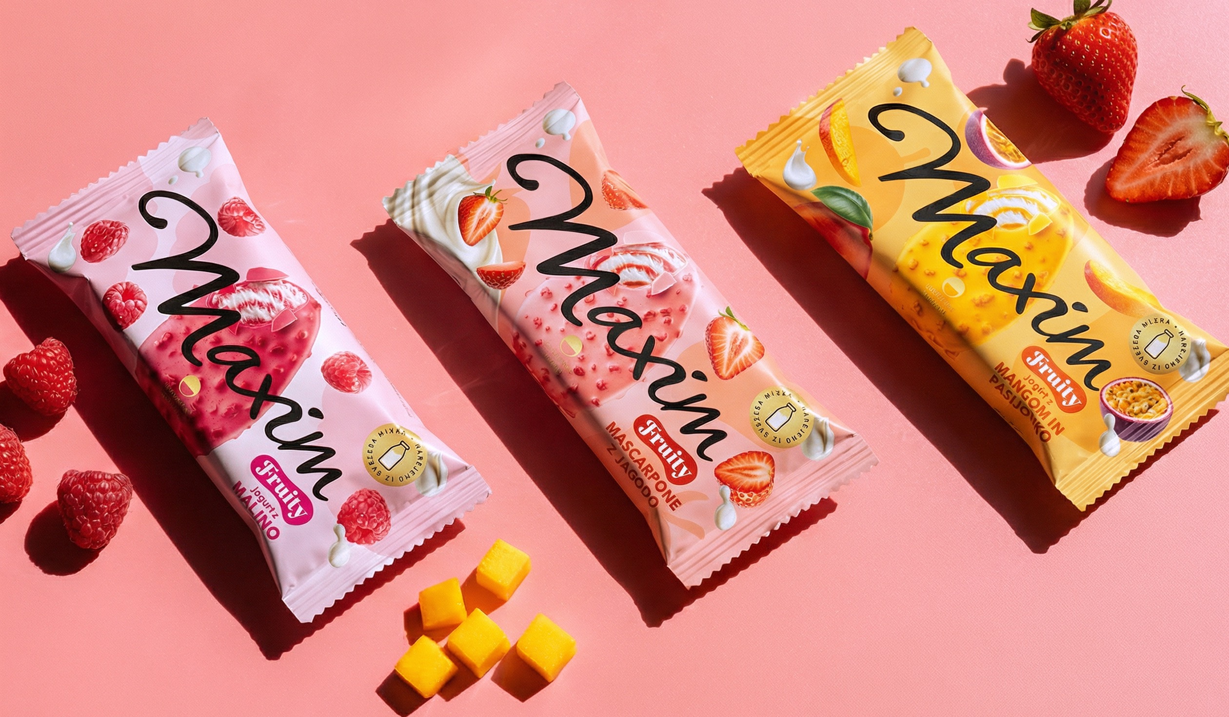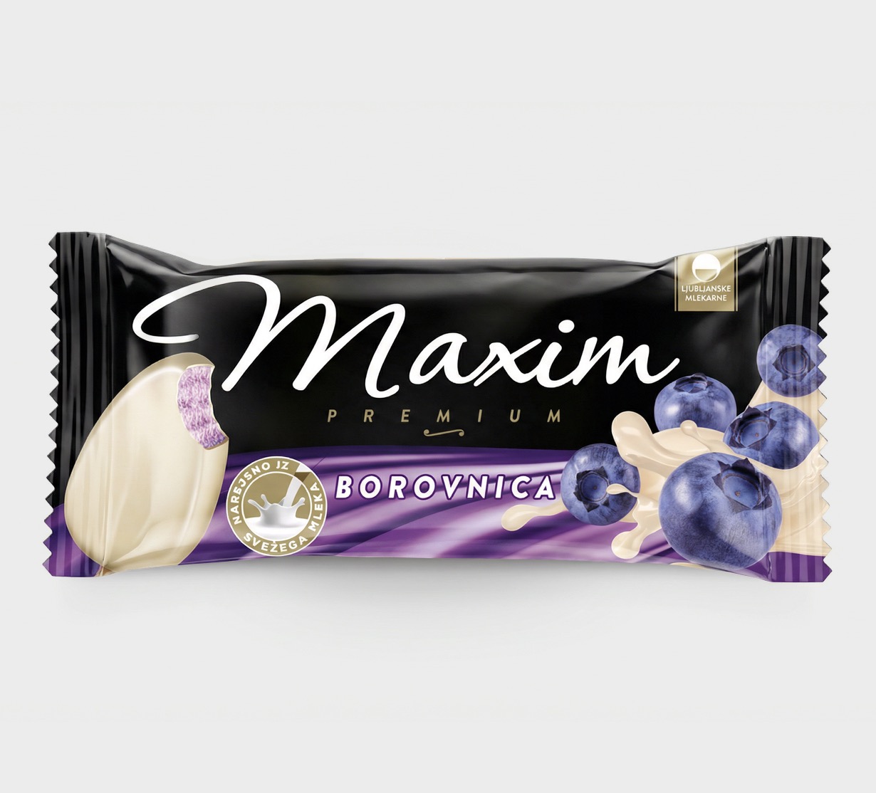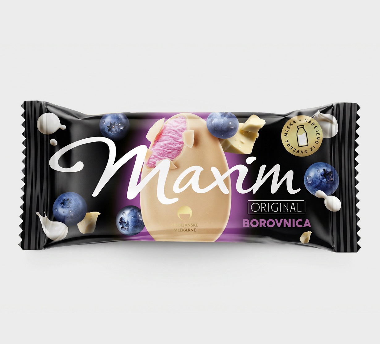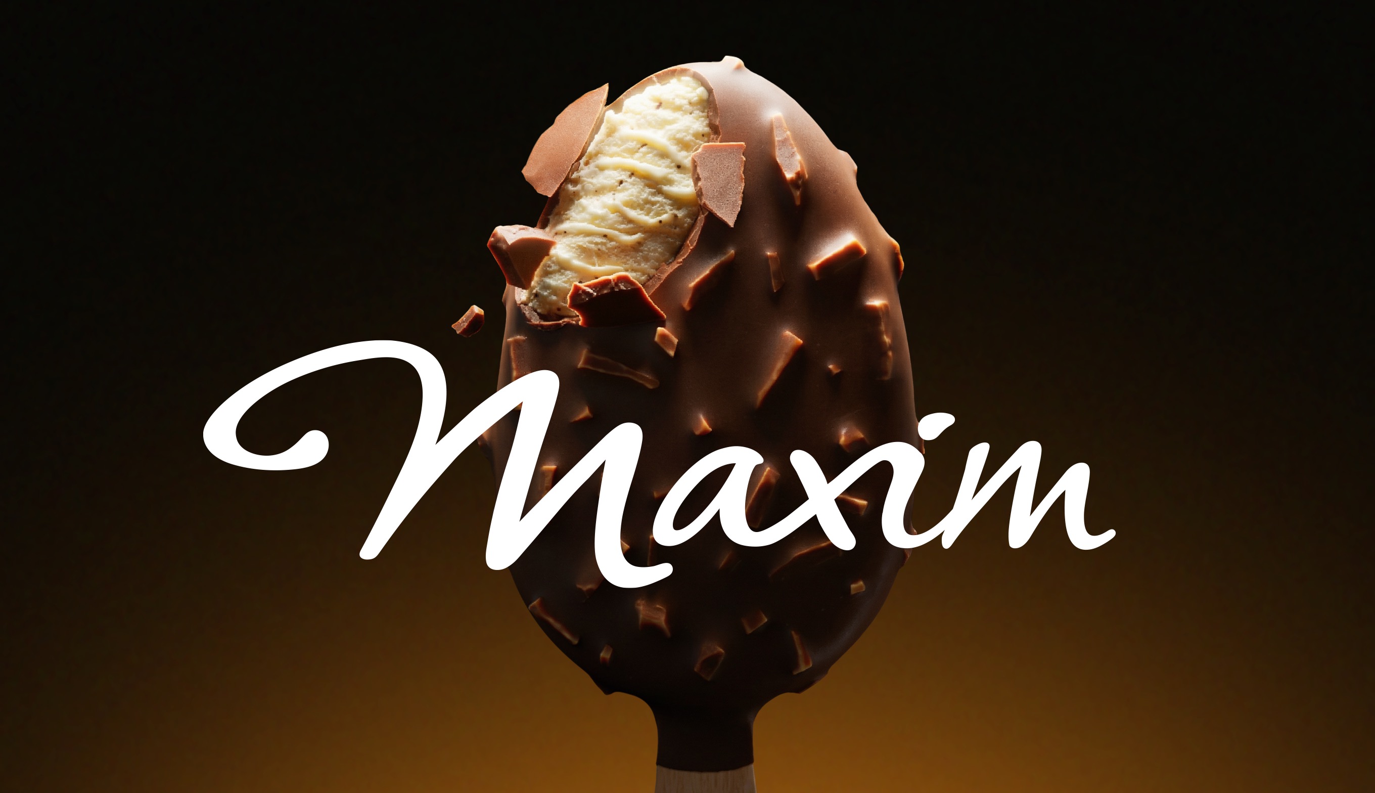
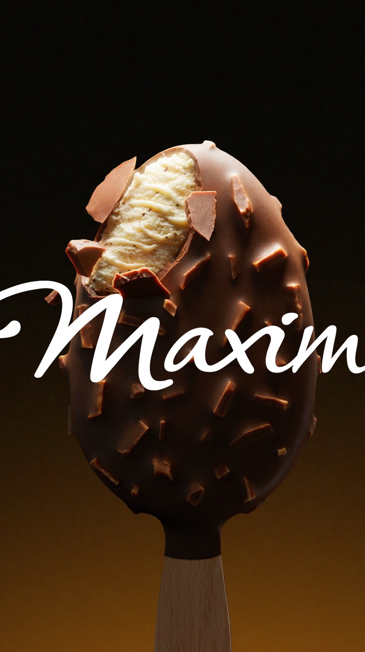
Maxim is a premium ice cream brand known for the richness of its creamy and fruity fillings. While the product delivered on taste and quality, its design didn’t fully express that indulgence; a missed opportunity in a highly impulsive category where desire is everything. The challenge was to elevate Maxim’s visual identity while showcasing its expertise across two distinct worlds: the classic chocolate-coated range and a new fruity collection. The redesign needed to strengthen shelf appeal, highlight the product’s delicious textures, and reaffirm Maxim’s premium credentials in the freezer aisle.

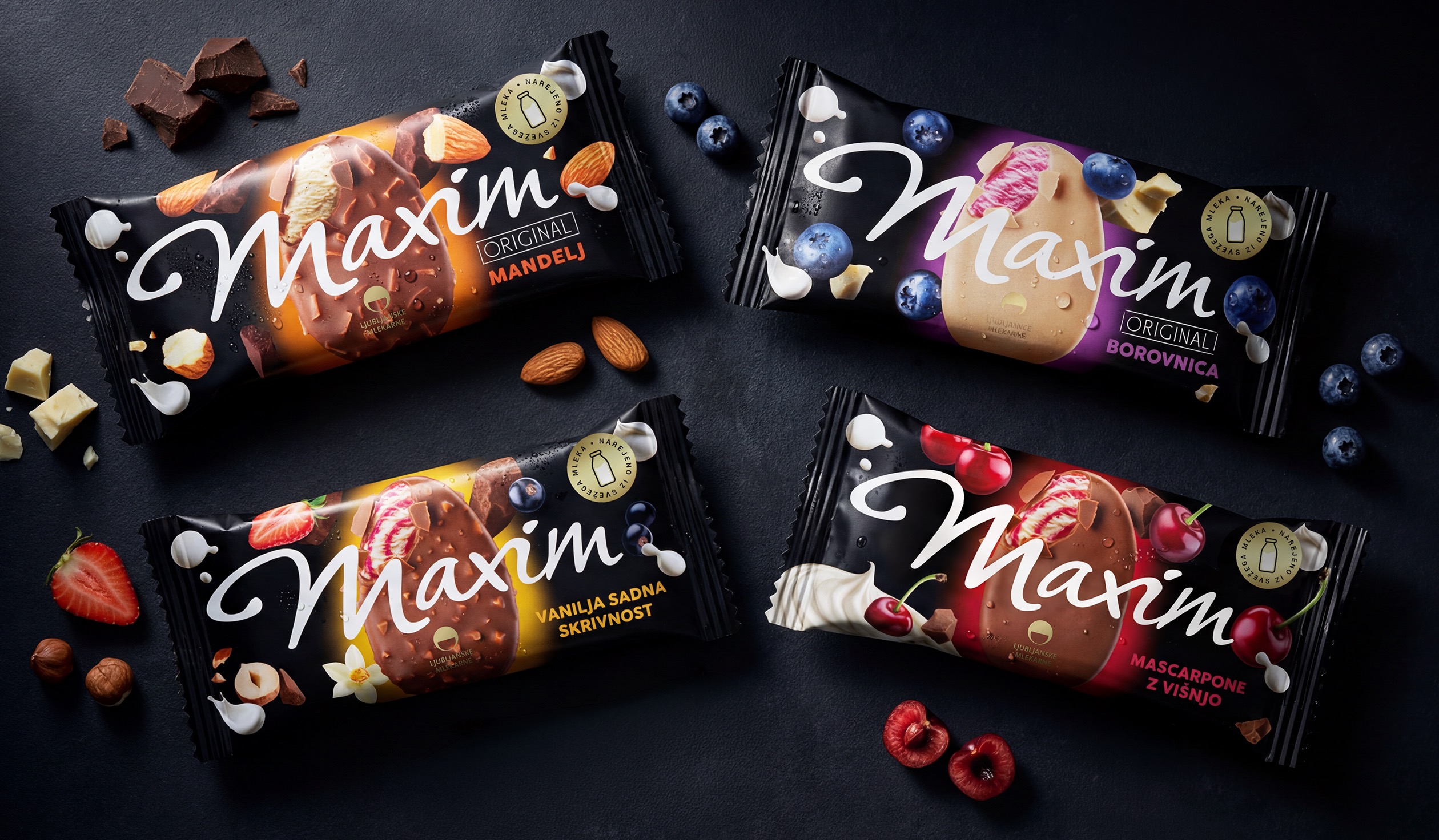
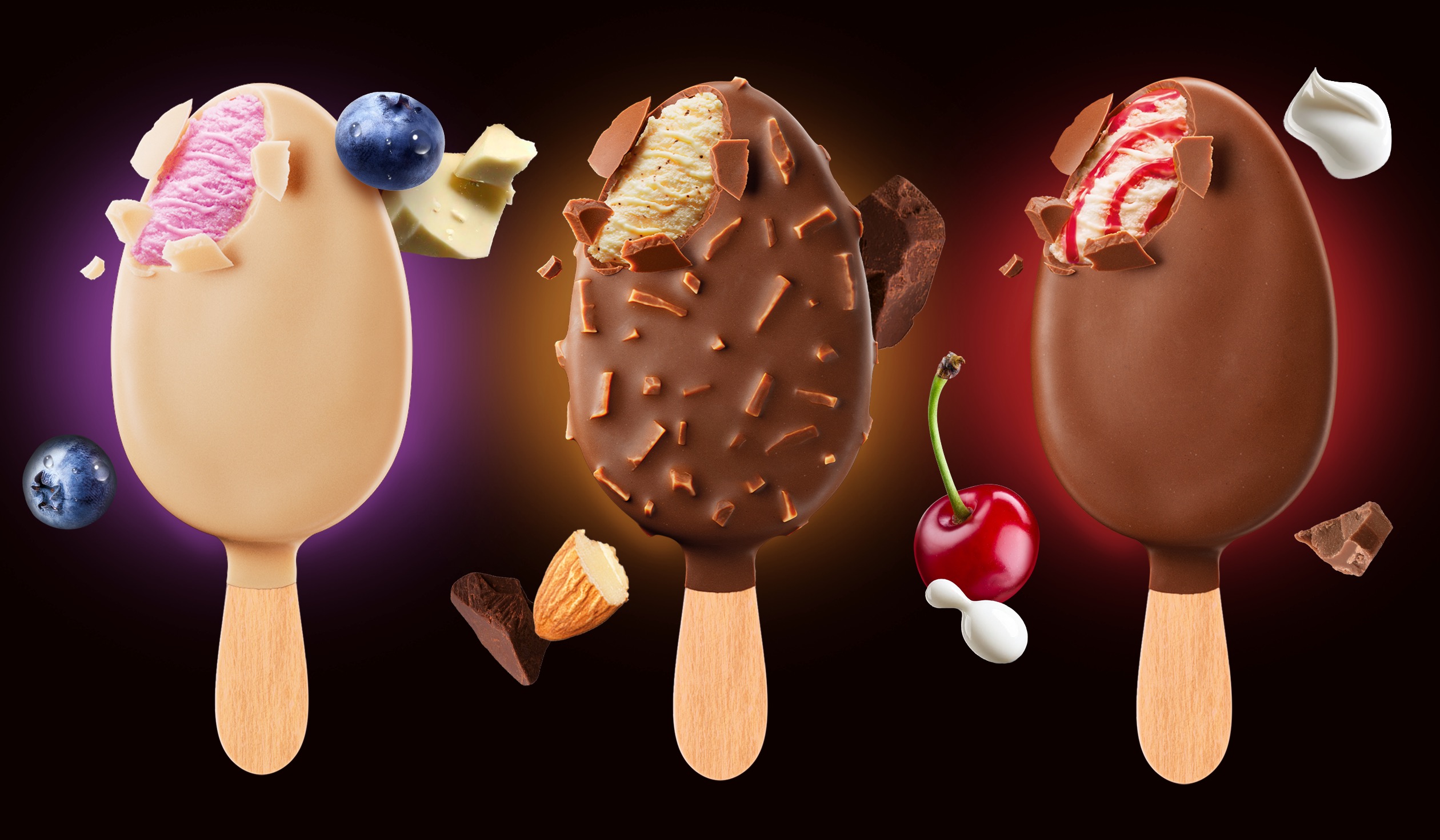
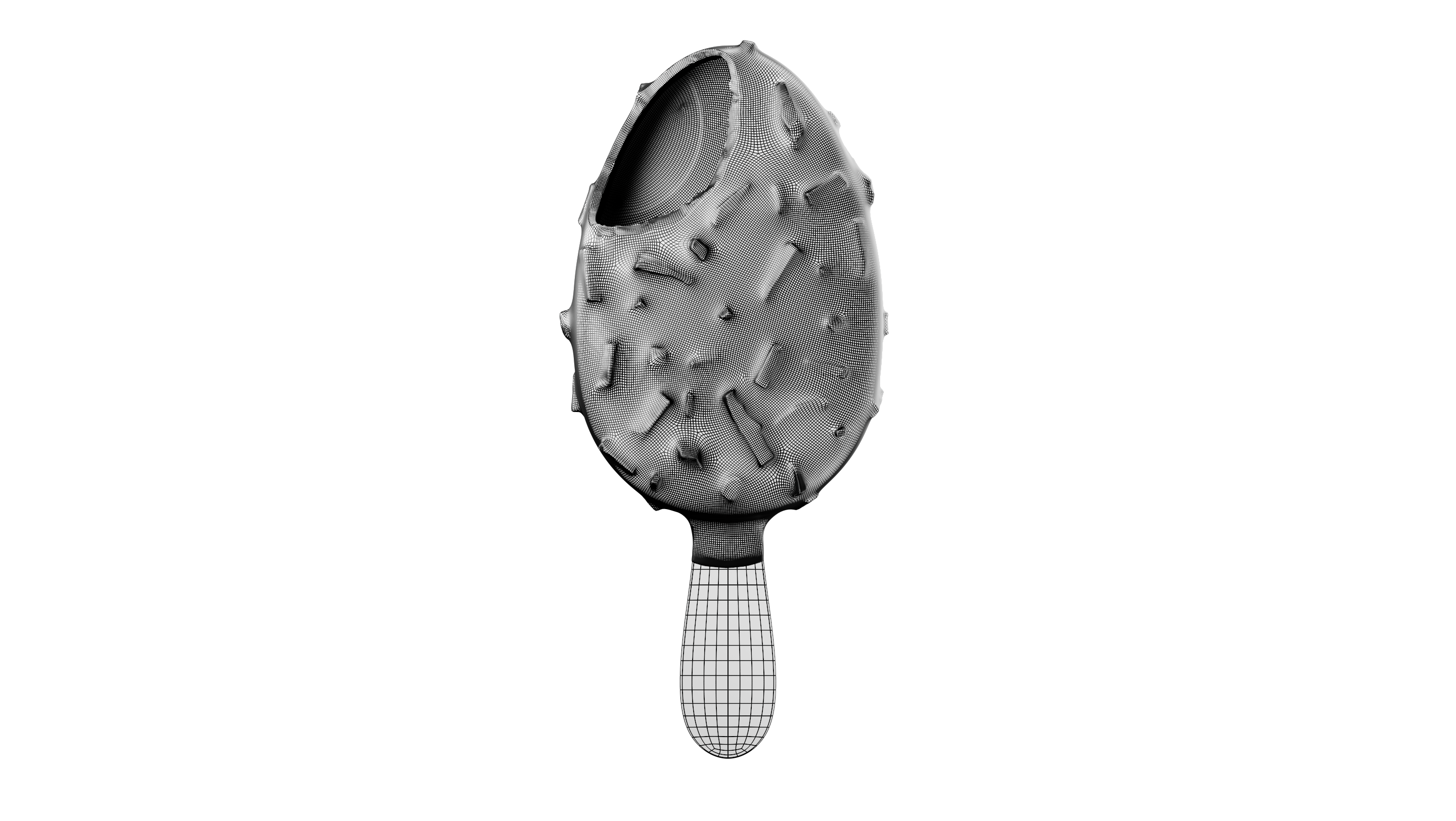
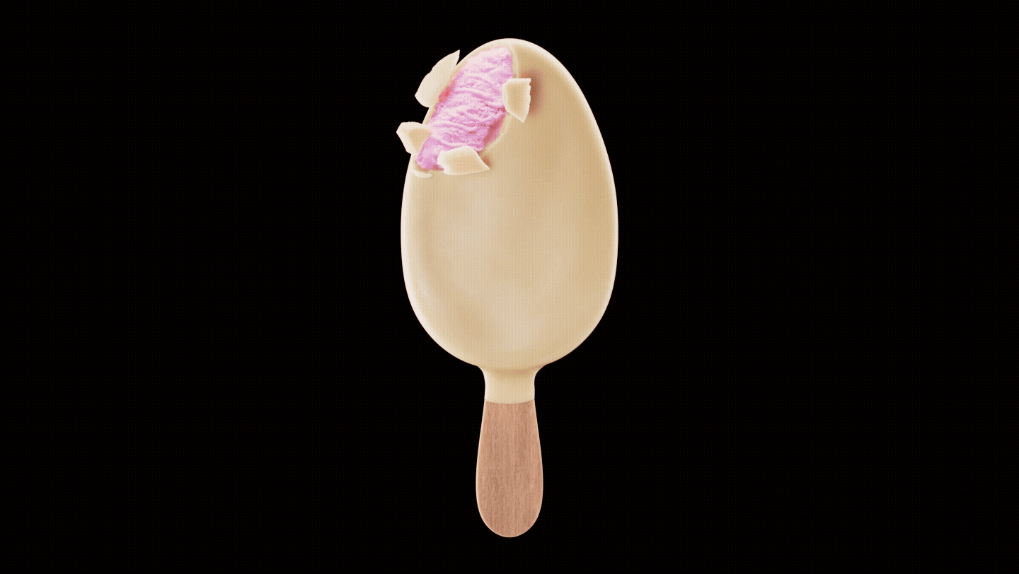
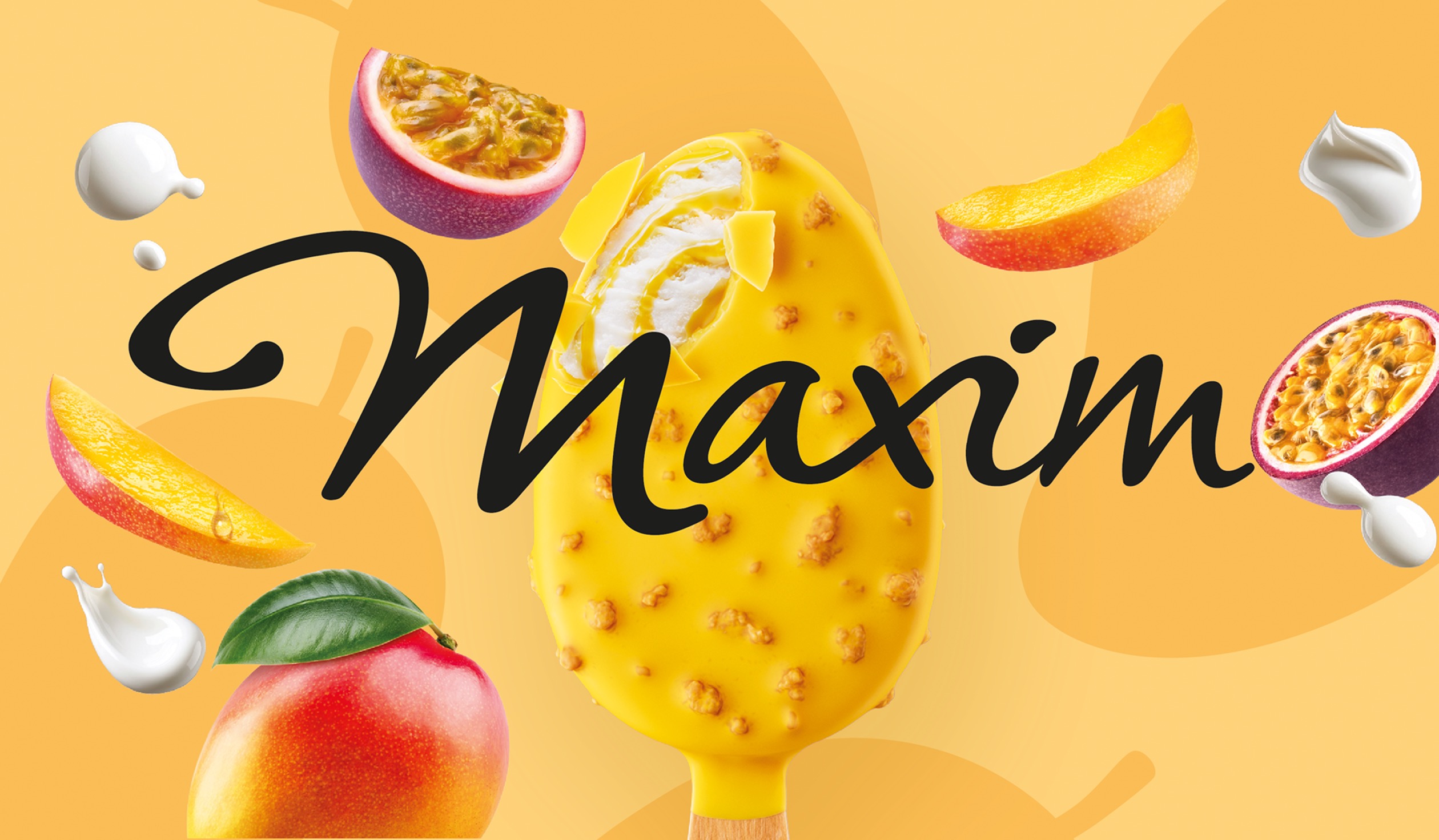
We reimagined Maxim’s packaging by amplifying its key brand assets, the iconic black background, the elegant logotype, and the ice cream stick itself. At the center of the design, a fully CGI-crafted stick becomes the hero. With enhanced crunchy coatings and luscious creamy fillings revealed, it delivers a powerful sense of indulgence. The updated Maxim logo elegantly overlaps the product visual while ingredients swirl around it, creating a rich and tempting universe. For the fruity line, we flipped the visual system into a vibrant, colorful world. Bright backgrounds and juicy fruit cues bring energy and freshness, while the black Maxim signature ensures strong brand recognition. The result: a bold, seductive design made to spark instant craving in every freezer.