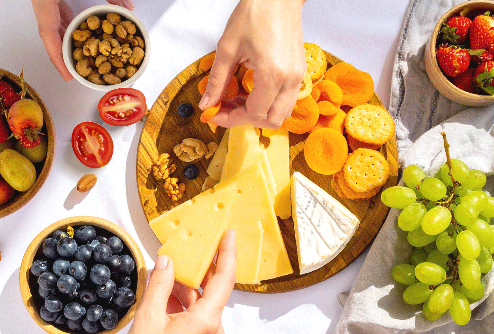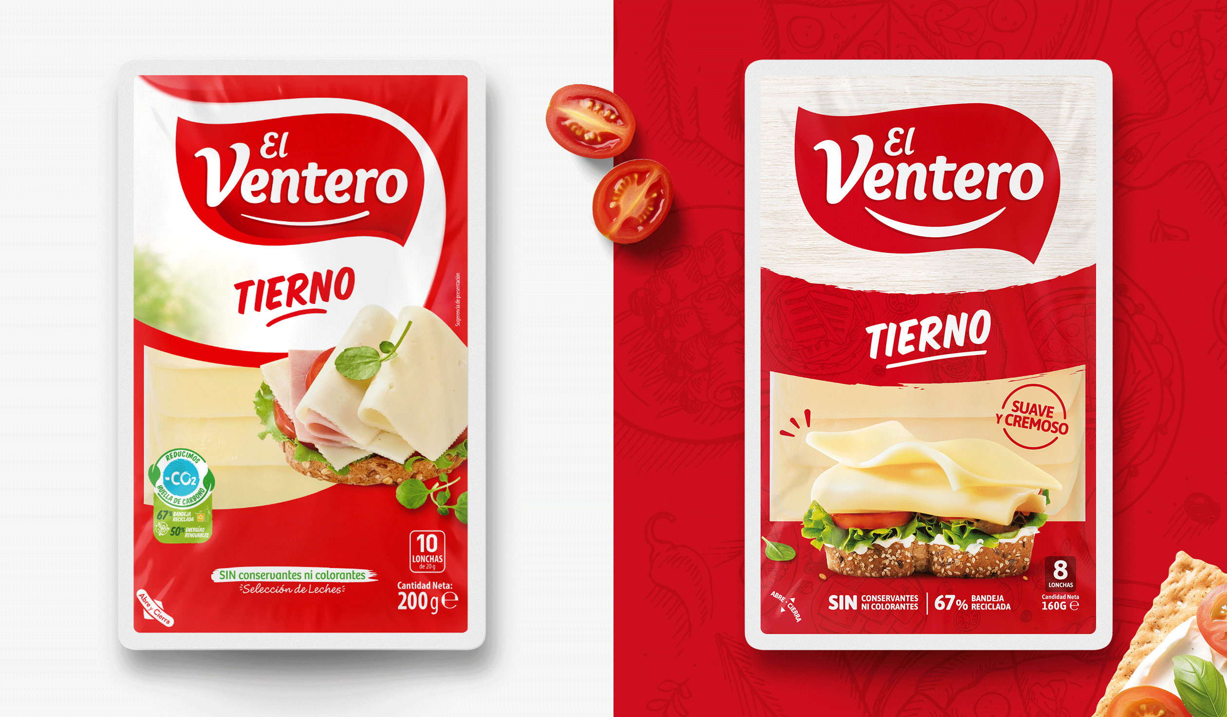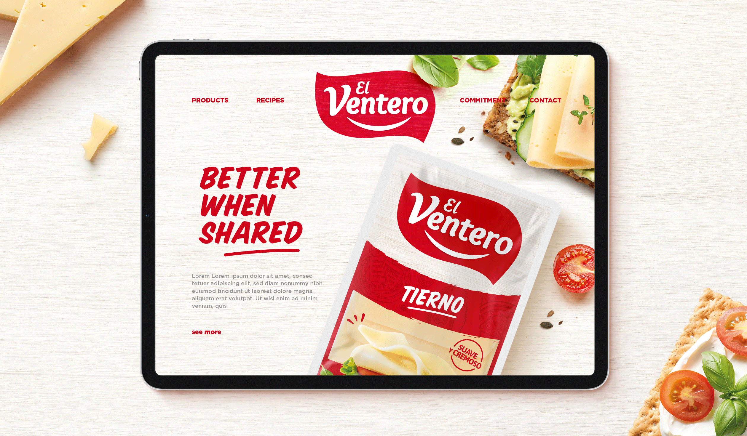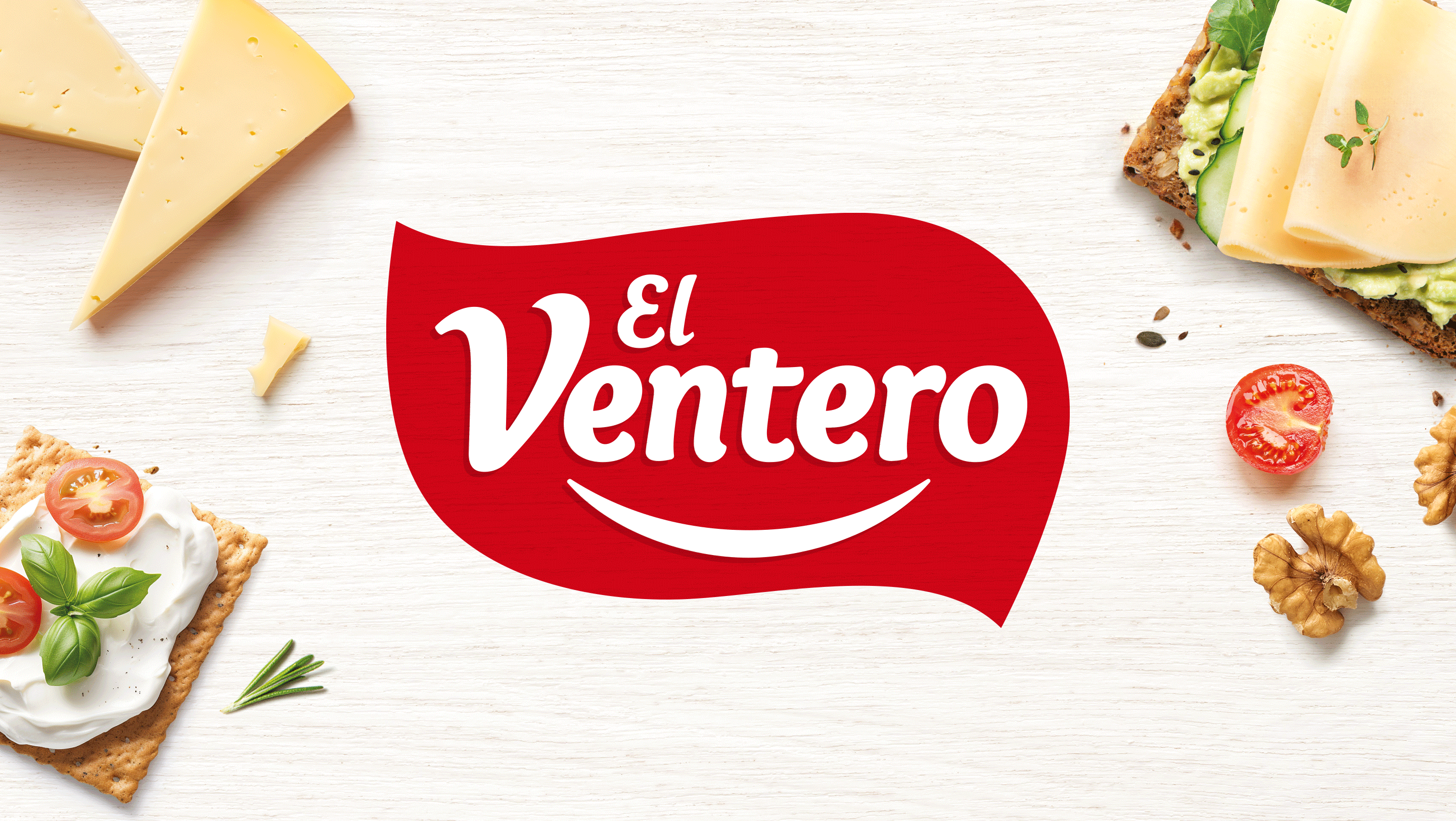
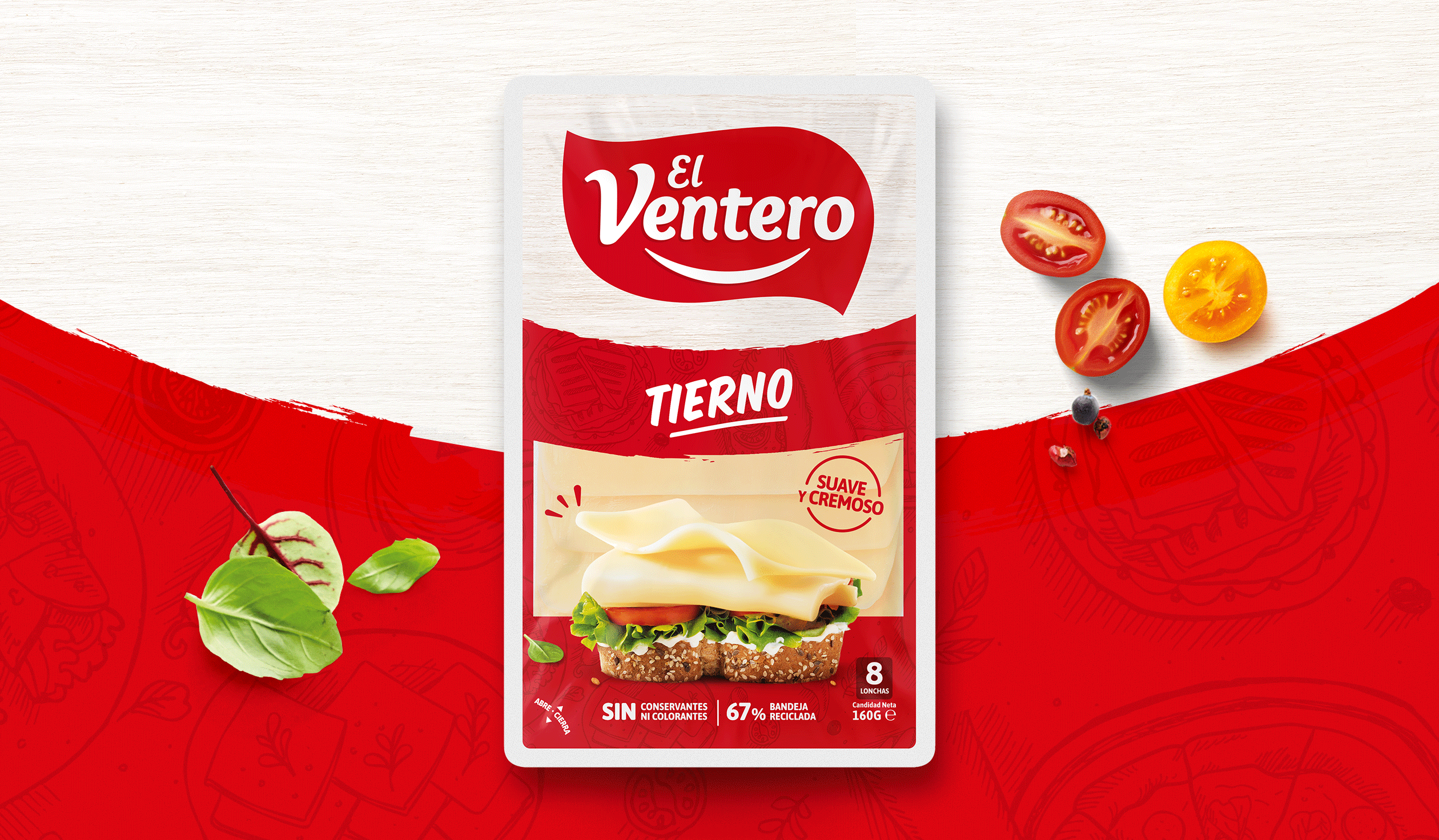
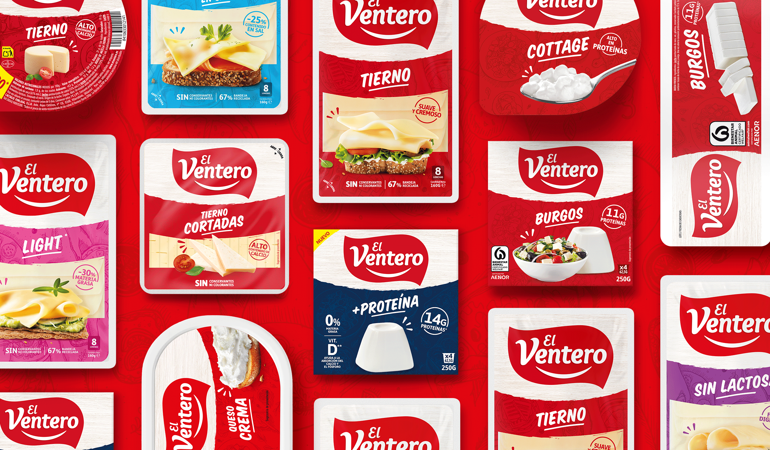
El Ventero is one of those brands you grow up with — iconic, emotional, and proudly present on Spanish tables. But like many patrimonial brands, it faces mounting pressure from private labels. The challenge was twofold: reinforce what makes El Ventero so beloved — its tenderness, authenticity, and everyday appeal — while creating visual consistency across a wide and diverse range. Because whether it’s a quick slice, a family snack, or a relaxed picoteo, El Ventero is always there — soft, simple, and genuinely good.
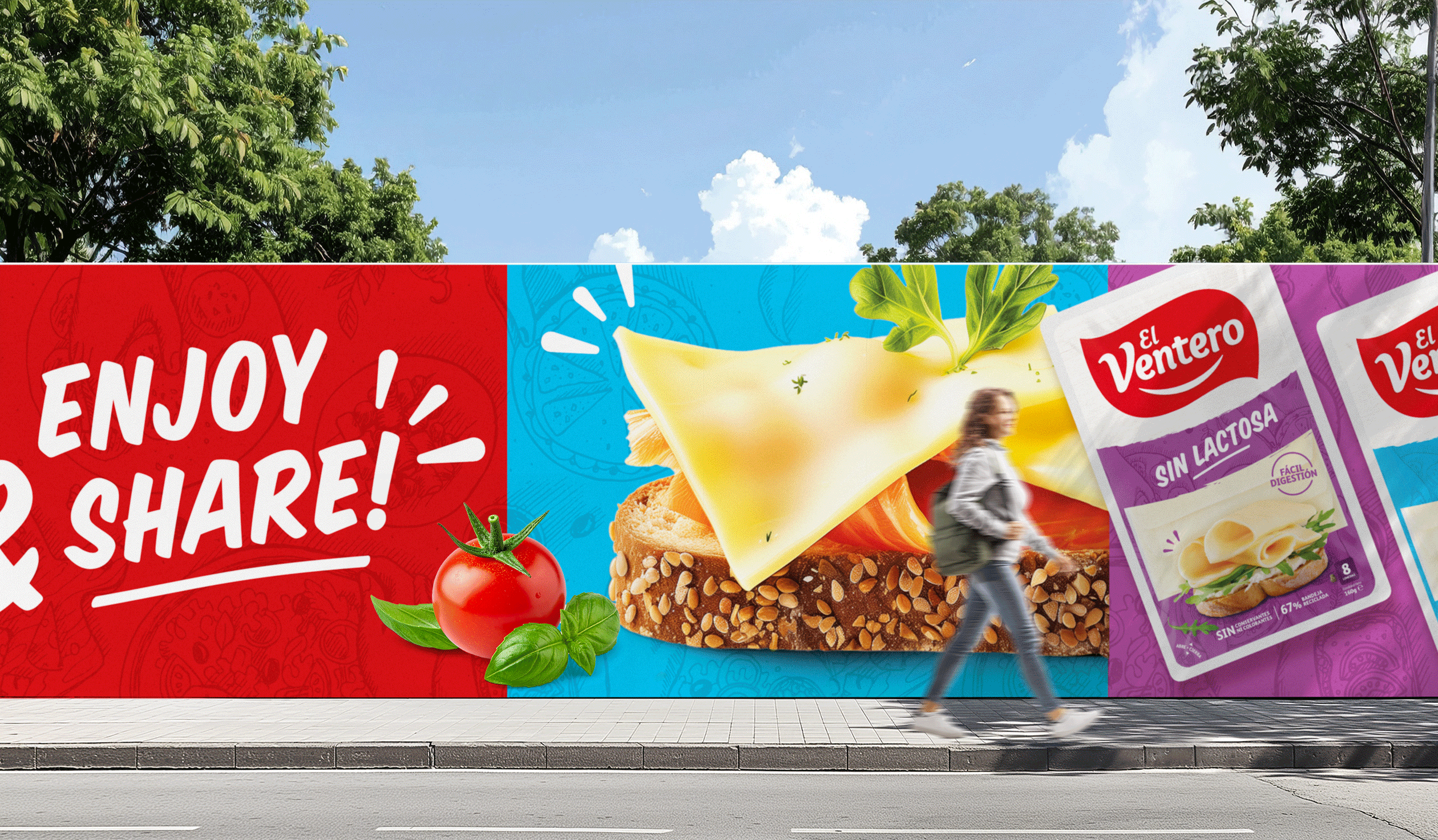
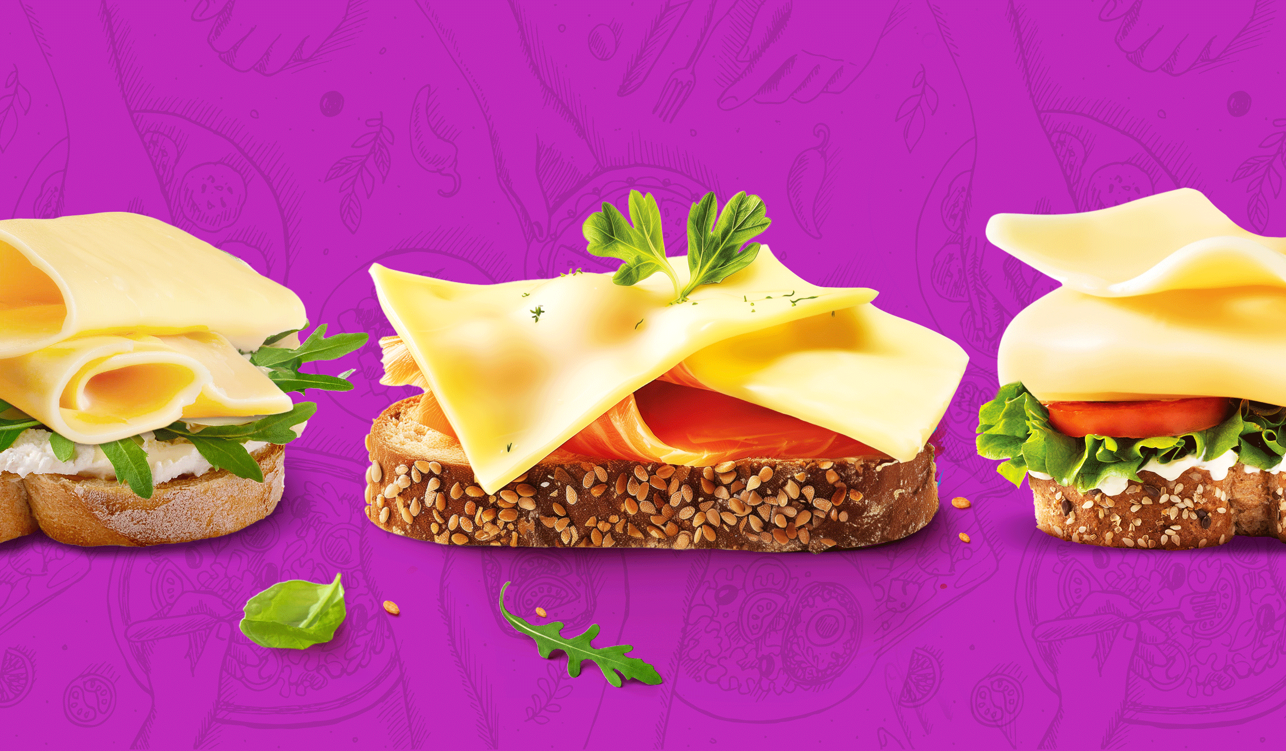
We elevated El Ventero’s personality by building on its most meaningful assets: the iconic red, its approachable logo, and that unmistakable sense of warmth. To unify the range, we introduced a cohesive visual system — from spontaneous illustrations in the background to rich, front-facing product visuals that hero the El Ventero difference. Even its new protein line embraces the brand’s essence: quality, simplicity, and joy. From sliced cheese to cottage the new design brings softness and pleasure to every bite, just like El Ventero always has.